-
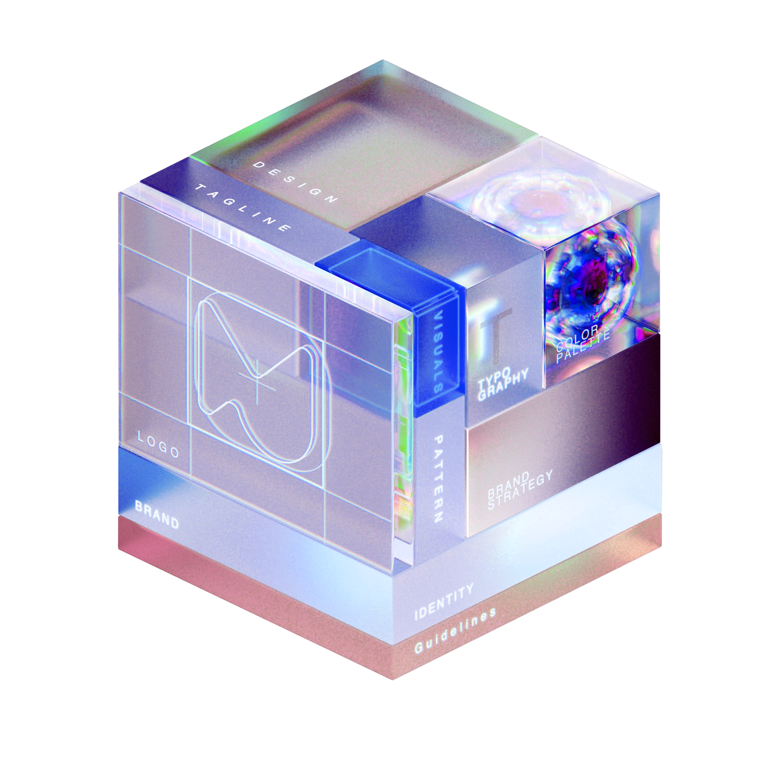
Semantic color palette
Typography (preconfigured font styles: display, headline, body, caption)
Spacing scale for consistent margins and padding
Shapes & Elevation (corner-radius, shadows, borders)
Iconography (SF Symbols & custom icons)
-
Reusable ViewModifiers
Global theme settings (EnvironmentKeys)
Semantic extensions (Color, Font, Image)
-
Atoms (Buttons, TextFields, Toggles, Badges)
Molecules (Form rows, input groups)
Organisms (Navigation bars, tab bars, dialogs)
Templates (Consistent page scaffolds)
-
Dark/Light mode
Dynamic Type support
Accessibility enhancements (VoiceOver, high-contrast)
Localization & RTL layouts
-
SwiftUI previews for every component
Comprehensive DocC documentation
Demo app to showcase components
-
App logo (PNG)
Color definitions (Swift code)
Typography specifications (free fonts)
TextFields (default, active, disabled states)
Buttons (primary, secondary, supportive)
10 custom interface icons (PDF)
5 Empty-state placeholders